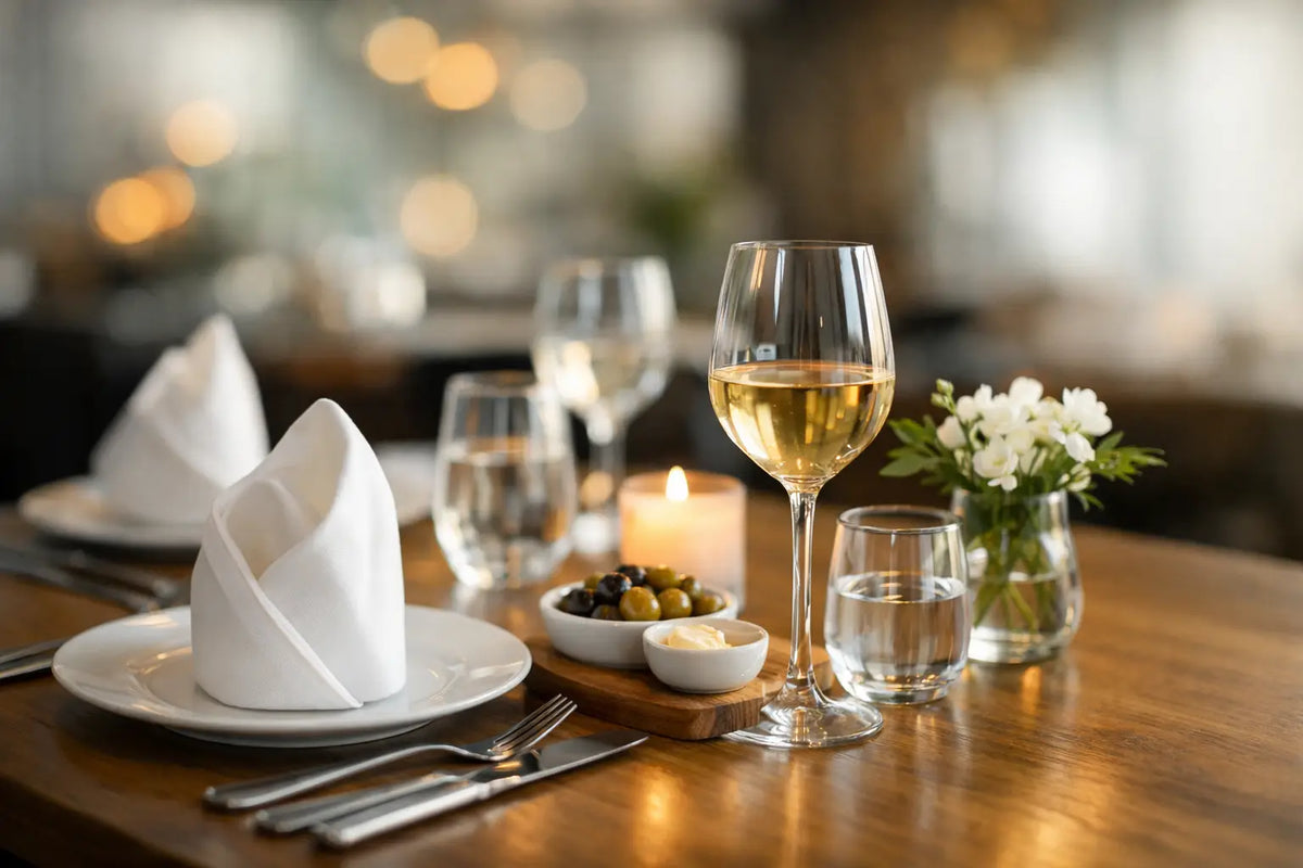
Tabletop Presentation for Hospitality That Guests Feel
A guest notices the weight of a water glass before reading the menu. They register the sheen of a porcelain cup, the clarity of a wine glass, and the space around a place setting almost instinctively. Tabletop presentation for hospitality is not decorative excess. It is the quiet visual language that tells guests how carefully an establishment considers their time.
For restaurants, cafés, hotels, and event spaces, that language needs to be beautiful without becoming precious. The strongest tablescapes create a distinct point of view while supporting the pace, durability, and consistency that service demands. Every vessel should earn its place through proportion, performance, and presence.
Tabletop Presentation for Hospitality Starts With a Point of View
A memorable tabletop does not require more objects. It requires a clearer idea. A coastal hotel bar may lean into luminous stemware, relaxed linen, and a sun-washed palette. A modern urban café may prefer crisp white porcelain, sculptural glass, and restrained accents that let the espresso ritual take center stage. Both can feel elevated, but they should not feel interchangeable.
Start by identifying the experience you want to create in a guest's first thirty seconds. Is it celebratory and polished? Warm, neighborhood-driven, and tactile? Quietly formal? Your answer should guide the choice of glass silhouette, ceramic finish, flatware profile, and even how much open space remains on the table.
This is where cohesion matters more than matching every piece. A table can pair contemporary crystal with handmade-looking linen or classic porcelain with modern brushed metal. The elements simply need a shared visual rhythm. Repeating a shape, color family, or level of refinement helps the setting feel curated rather than assembled.
Let the Beverage Program Shape the Table
Beverages often occupy more of the guest's time and attention than any other item on the table. A morning cappuccino, pre-dinner cocktail, celebratory champagne pour, or late-night digestif each creates an opportunity for presentation to carry the brand forward.
Choose vessels around the drinks you actually serve, not a generic checklist. A bar with an ambitious cocktail program benefits from glassware that gives stirred drinks clarity and composed proportions, while aromatic cocktails may need a more generous bowl. A wine-focused dining room should consider the balance of the stem, the feel of the rim, and how gracefully the glass sits alongside plates and candles. For coffee service, a cup and saucer should feel intentional in the hand, preserve the warmth of the drink, and give the guest a composed place to set a spoon or small accompaniment.
Collections are especially useful here because they bring visual continuity across dayparts. Lead-free crystal from a line such as Figueroa can give cocktails, wine, and sparkling service a unified polish, while porcelain espresso and cappuccino pieces like the Wilshire collection establish a refined finish for the coffee course. The goal is not to make every drink look the same. It is to make each one feel like it belongs to the same house.
Build the Table From the Guest's Perspective
Designing from overhead can be useful. Designing from the chair is essential. Sit at a fully set table and look for the small friction points that diagrams miss: a water glass that crowds the wine pour, a saucer that slides when a guest reaches for sugar, a centerpiece that prevents conversation, or a plate arrangement that leaves nowhere comfortable to rest a cocktail.
The most successful presentation makes room for movement. Servers need clear landing zones. Guests need easy access to water, condiments, and shared dishes. Glassware needs enough separation that a relaxed gesture does not become an expensive collision. A beautiful table that causes service hesitations will lose its appeal quickly, especially during a busy shift.
Scale is the usual culprit. Larger vessels can create immediate drama, but they demand more real estate and may overwhelm an intimate two-top. Delicate glassware can suit a tasting-menu environment yet prove impractical for a high-volume patio. There is no universal right answer. It depends on table size, seat count, menu format, lighting, and how quickly the room turns.
Use Negative Space as a Design Material
A crowded tabletop communicates abundance, but it can also create visual fatigue. Negative space gives a setting confidence. It allows the color of a cocktail, the glow of candlelight, and the geometry of a well-made glass to register clearly.
Rather than adding another decorative piece, consider removing one. A single low floral element or a restrained candle can be more effective than a cluster of objects competing with food and drink. This approach is particularly valuable in cafés and all-day venues, where tables must transition easily from a laptop-and-latte moment to a lunch setting without feeling over-styled.
Negative space also photographs better. Guests often share the moments that feel composed rather than contrived: a sparkling pour catching afternoon light, an espresso arriving on a clean saucer, or a dinner table that glows without visual clutter. Those images extend the hospitality experience beyond the room.
Material and Light Change the Entire Read
Materials make an immediate emotional impression. Clear crystal lends brightness and precision. Porcelain brings calm, structure, and a sense of ceremony. Textiles soften hard surfaces and absorb some of the room's visual noise. Metal accents can add contrast, though too much shine can make a setting feel cold under direct lighting.
Light determines whether those materials perform as intended. In daylight, transparent glassware can feel airy and architectural. At night, the same glass can capture reflections from candles and pendants, giving a table depth without added decoration. Test glassware under actual service lighting before committing to a full program. A shape that looks beautiful in a showroom may disappear in a dim dining room, while a textured or faceted surface may become too visually active.
Color should be treated with the same restraint. Neutral ceramics create flexibility across seasons and menus, while a signature accent can help a venue become recognizable. If the menu itself is colorful, neutral drinkware and tableware often give the food room to speak. If the culinary presentation is minimal, a softly tinted glass or tonal textile can add warmth and identity.
Consistency Is a Luxury Signal
Guests may not name the details, but they feel inconsistency immediately. A beautifully styled table loses credibility when one glass is cloudy, one cup is chipped, or replacement pieces do not match the original service. This is why hospitality tabletop planning should account for replenishment from the outset.
Choose pieces that are designed for everyday use, then establish standards for polishing, storage, rotation, and retirement. Train the team on how each vessel is meant to be carried and cleared. Keep a practical backstock so breakage does not force a mismatched substitute onto the floor. These operational choices protect the visual experience just as much as the initial purchase does.
Consistency does not mean rigidity. Seasonal napkins, changing floral moments, or a limited-edition cocktail presentation can refresh the room while the core service pieces remain recognizable. That stable foundation makes each new detail feel deliberate instead of disconnected.
Design for the Moment After Service
The table is most powerful when it supports a feeling guests carry with them. Perhaps it is the satisfying balance of a coupe in hand, the clean silhouette of a cappuccino cup at the end of a long meal, or the way a simple water service made an ordinary lunch feel considered.
That is the standard worth designing toward. Choose fewer, better pieces. Give every object enough space to be seen. Then let the quality of the service, the drink, and the conversation complete the presentation.